
MVGO · Munich public transport
Which zone do I need?
I landed in Munich after a 20-hour flight and nearly bought the wrong train ticket.
- Role
- Concept · Product design
- Timeline
- 2026 (Q3)
- Platform
- iOS, MVGO app
- Tools


The moment
I found the right app, picked up my bag and went down to the S-Bahn platform under the terminal. The train into the city was already waiting with its doors open.
The app asked me one thing I couldn’t answer: Area of validity. It showed a row of circles labelled M, then 1 to 12. There was no map and no hint about which zone the airport was in.
Munich prices public transport by zones. Whether you buy a single ticket or a day ticket, you pick the zones first. Locals know theirs. I had just landed.
If you buy too few zones, you’re riding without a valid ticket, and the fine is €60. If you buy too many, you overpay on every trip that day. With the doors open in front of me and 20 hours of travel behind me, I didn’t want to guess.
The app asked for knowledge I didn’t have, at the moment I had the least time to find it.
What went wrong
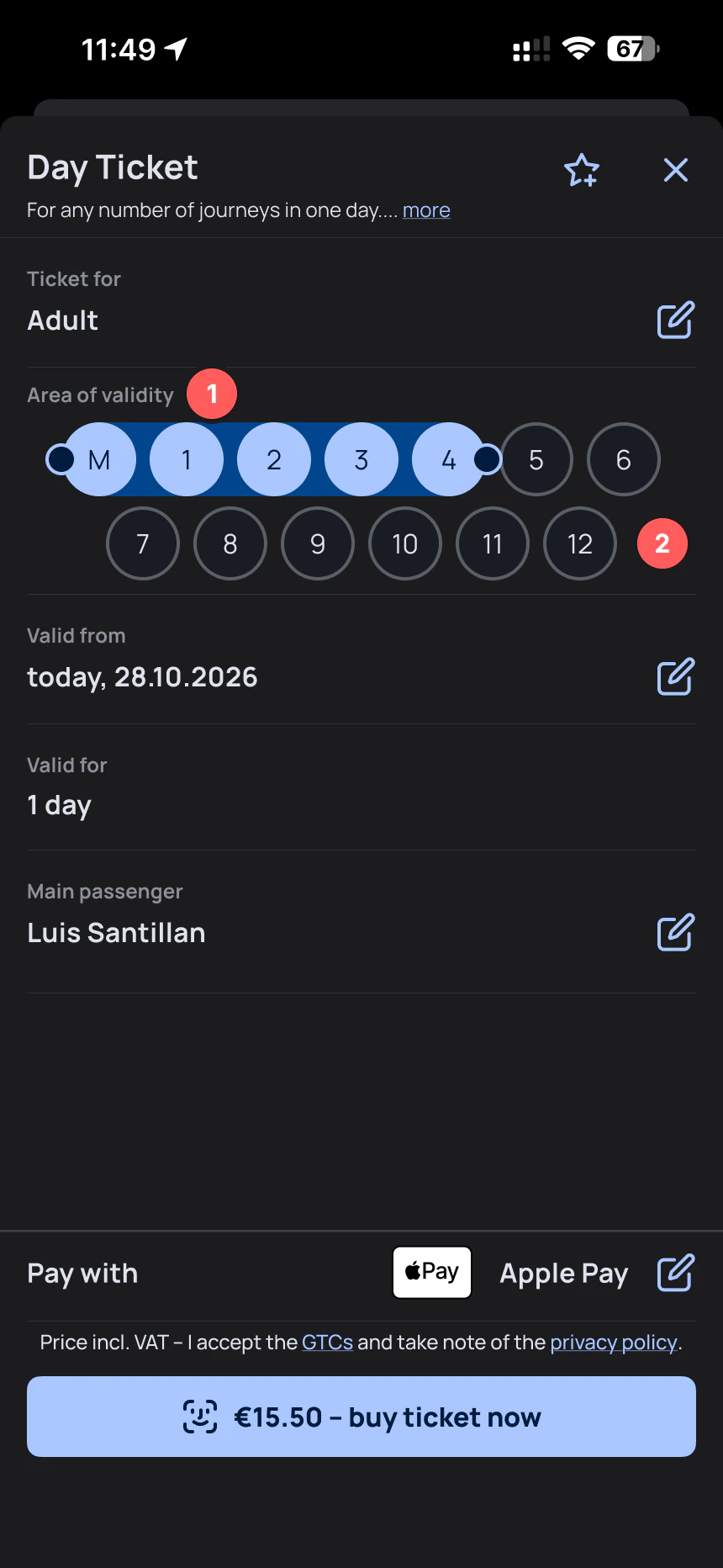
1
The question uses the system’s language.
2
The zone picker has no geography.
3
The answer lives outside the app.
Insight
Visitors know where they’re going. They don’t know which zone it’s in. So the app should ask for places and work out the zones itself.
Two ways to fix it
Both concepts use the same scenario: a first day in Munich with stops at Marienplatz, Olympiapark and the airport. The correct answer is zones M to 5, and the airport is what makes it tricky.
Concept A: Add places inline
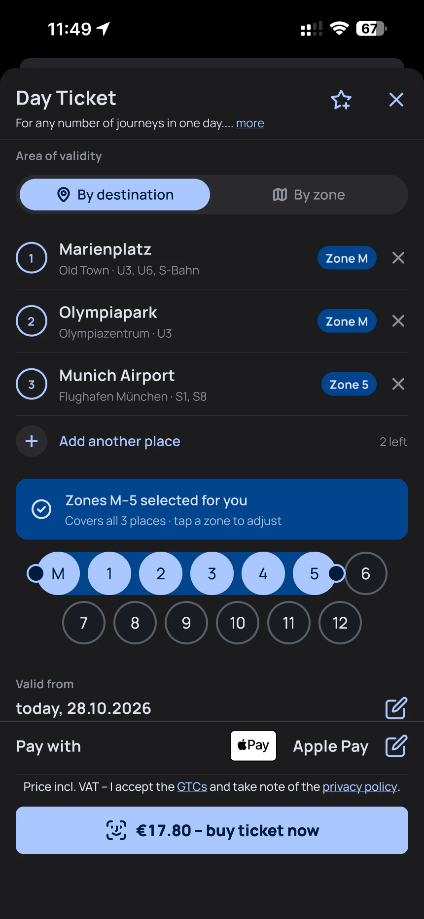
A1
Entry point
A2
Add a place
A3
Zones selected for you
The fix happens right where the problem appears, and the original zone picker still works for people who know their zones.
Concept B: A live trip planner
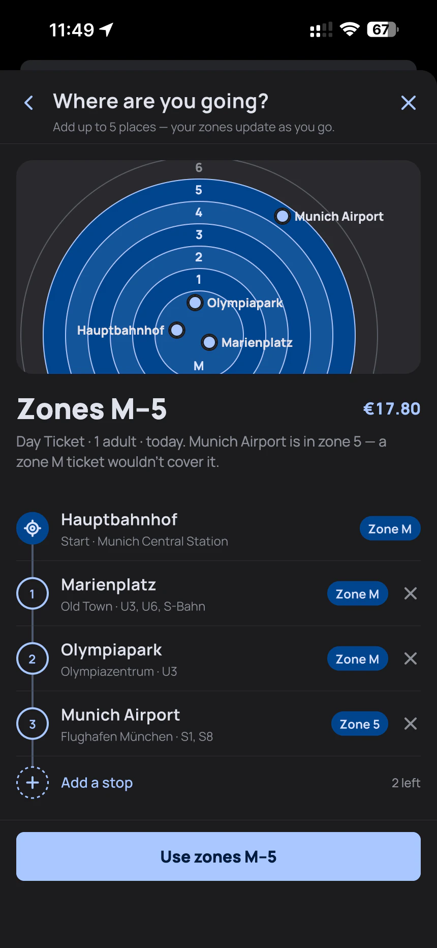
B1
Entry point
B2
Plan your trip
B3
Back to the ticket
It takes one extra screen, but it explains how the system works.
Comparing them
| A: Inline | B: Trip planner | |
|---|---|---|
| Where it lives | Inside “Area of validity” | A separate step, opened from a card |
| Change to the current app | Small: one new mode | Small on the ticket screen, plus 1 new screen |
| Teaches the zone system | A little, through zone badges | Yes, through the ring map and the explanation |
| Best for | A visitor on the platform, short on time | A visitor planning the day at the hotel |
- Where it lives
- A: Inside “Area of validity”
- B: A separate step, opened from a card
- Change to the current app
- A: Small: one new mode
- B: Small on the ticket screen, plus 1 new screen
- Teaches the zone system
- A: A little, through zone badges
- B: Yes, through the ring map and the explanation
- Best for
- A: A visitor on the platform, short on time
- B: A visitor planning the day at the hotel
My pick
I’d ship A first. It fixes the platform moment with the smallest change to the app, and people who know their zones keep the picker. B’s best parts, the zone explanation and the airport warning, could live inside A’s “Zones selected for you” banner as a “Why these zones?” link.
What I’d check next
01
Test it with real visitors.
02
Zone data.
03
Edge cases.
04
Language.
Notes to self
- 01Ask people for what they already know.
- 02A small fix still needs a real scenario. Using my own trip, with the airport as the trap, made every screen easier to judge.
- 03Keep the expert path. A better default for visitors shouldn’t slow down someone who knows they need M to 2.
This is a self-initiated concept, not affiliated with MVG or MVV. The zones and prices in the mockups are illustrative.
More notes
Or see WorkSmall studies and concept fixes.
Promnia
OfflineA prompt manager, archived before launch
A prompt manager I built to test how far AI could take a product.
2025 (Q2 to Q3)
Netflix · Disney+ · HBO Max
ConceptZero-Friction TV Login
Sign in to a streaming app on your TV with one tap from your phone, without QR codes, browsers or passwords.
2026 (Q2)